Description of the Course
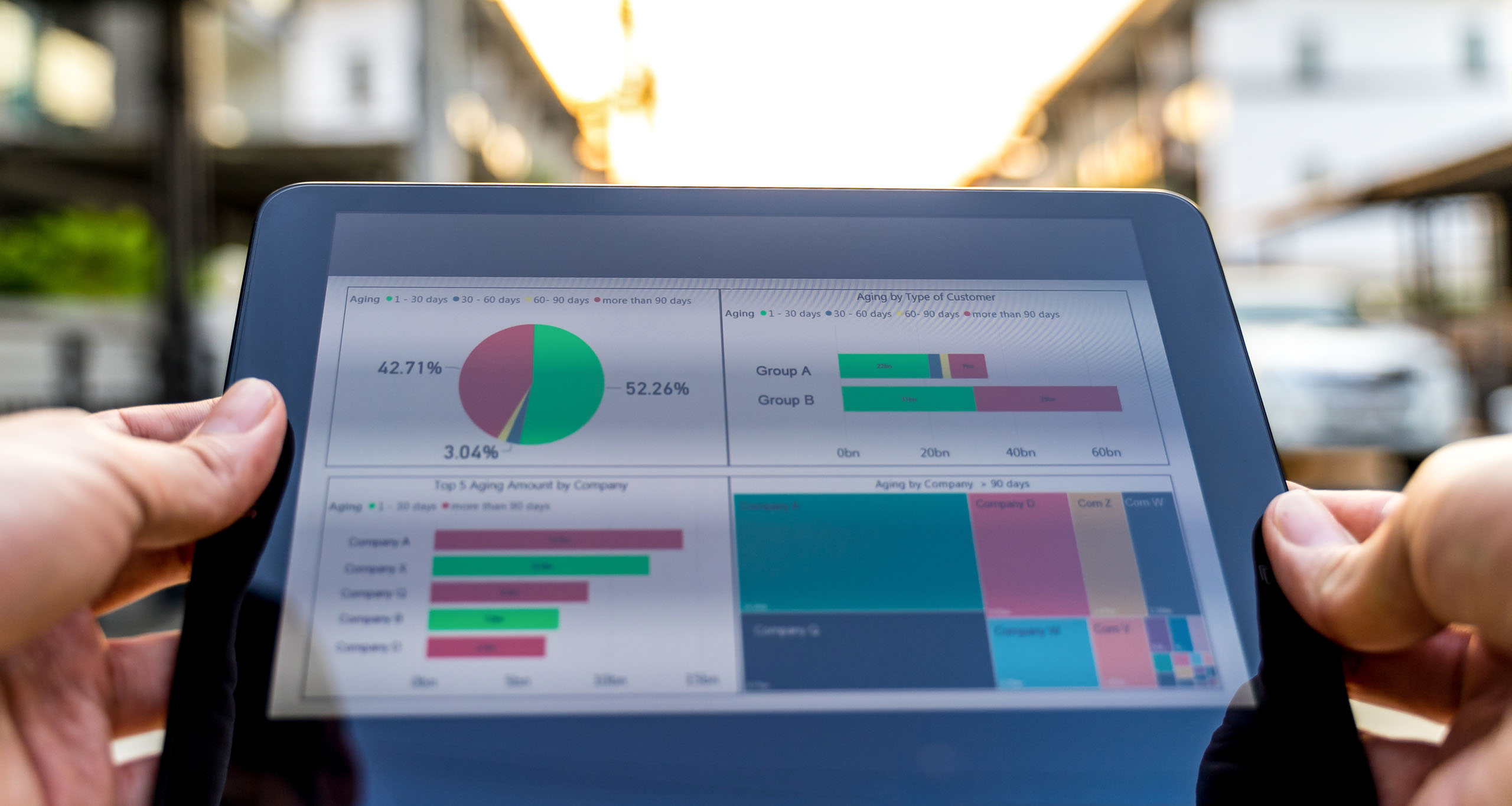
This masterclass is specifically designed to impart data analytics and data visualization skills to all the engineering & management students, faculties, industry professionals and start-ups. The program empowers them to interpret industry related large data sets using Tableau and master the art of visual storytelling for professional growth, decision sciences and business excellence.
Mode of Workshop : ONLINE
Date of the Workshop : 8th & 9th November, 2025
Timings: 10:00 a.m. - 01:00 p.m. (on both the days)
Profile of the Instructor

Dr. Arjun V. Singar aka Pundit Singri is a highly accomplished professional with expertise in Strategy and Data Visualization. He holds a Ph.D. in Learning & Education from the Department of Management Studies at the Indian Institute of Science (IISc) and Masters in Mechanical Engineering from Wayne State University, Detroit, USA. Dr. Singar is currently a Visiting HRM Course Instructor at IISc, Founder Educator at FRIYAY Learning Academy and Co-Founder & Executive Director at CREAA Academy for Learning (A New Concept CBSE School). He has also been a TEDx Speaker and a United Nations Youth Assembly Speaker in the past. With his strong academic background, entrepreneurial exposure and a decade of training experience, Pundit Singri hopes to empower the next generation students and professionals to be critical thinkers and problem solvers in the societies they choose to live in.
Module Details
Date : 8th November, 2025
Module Name :
Data Visualization
Concepts Covered:
Creation of Bar Charts, Graphs and Analytics with Time series, Aggregation & Filters.
Learning Outcomes:
The program empowers them to interpret industry related large data sets using Tableau and master the art of visual storytelling for professional growth, decision sciences and business excellence.
Date : 9th November, 2025
Module Name :
Data Visualization
Concepts Covered:
Analytics with Time series & Aggregation and Creation of Line & Area Charts, Maps, Scatterplots & Dashboards.
Learning Outcomes:
The program empowers them to interpret industry related large data sets using Tableau and master the art of visual storytelling for professional growth, decision sciences and business excellence.
Intended Audience & Fees for the Workshop
Intended Audience:
Engineering & Management Students, Faculties, Industry Professionals and Start-Ups.
Fees :
Students & Faculties : Rs 708 (Rs 600 + 18% GST)
Industry Professionals & Start-ups : Rs 1416 (Rs 1200 + 18% GST)
Certification
Certificates will be awarded to all the participants who attends the workshop
Feedbacks from previous batch
Arjun sir, thank you so much for the wonderful session. Please conduct the workshops on tableau for advanced analysis also.
-Mahathi
Excellent delivery. Good knowledge. Appreciate his composure and patience.
-NITIN Kumar Raghav
I am very satisfied with the training content. The instructor was very patient with our batch and answered everyone's queries. I highly recommend this training to anyone who has not been introduced to Tableau.
-Gaurav Pant
It's fascinating, the main part is was enjoyable and totally understandable even for beginner.
-MONODIP BANERJEE
Very well conducted workshop in every aspect..
-Dr. Menakshi Pachori
The purpose of using the statistical analysis was well explained
-PAVALA KUMAR B
Excellent session with hands on experience
-S Padmapriya
A very useful session to start working with tableau and concepts were thought clearly and now one will be able to work with tableau and have got some knowledge in Data visualization
-Y.RITHIKA SRI
For beginners its really helpful. You can go for this if you want to start your tableau journey.
-Atharva Ubale
Attend the Valuable Workshop and get certified by spending 6 hours.
-KARTHIKEYAN K R
Go to join the workshop because all studying material are worth it
-Sonu Kumar Ray
Wonderful experience! In two days, how solemnly I have learned basic Tableau which will help not only for personal work but also for industrial purposes. It's an amazing.
-Basabdutta Mondal


Reviews
There are no reviews yet.